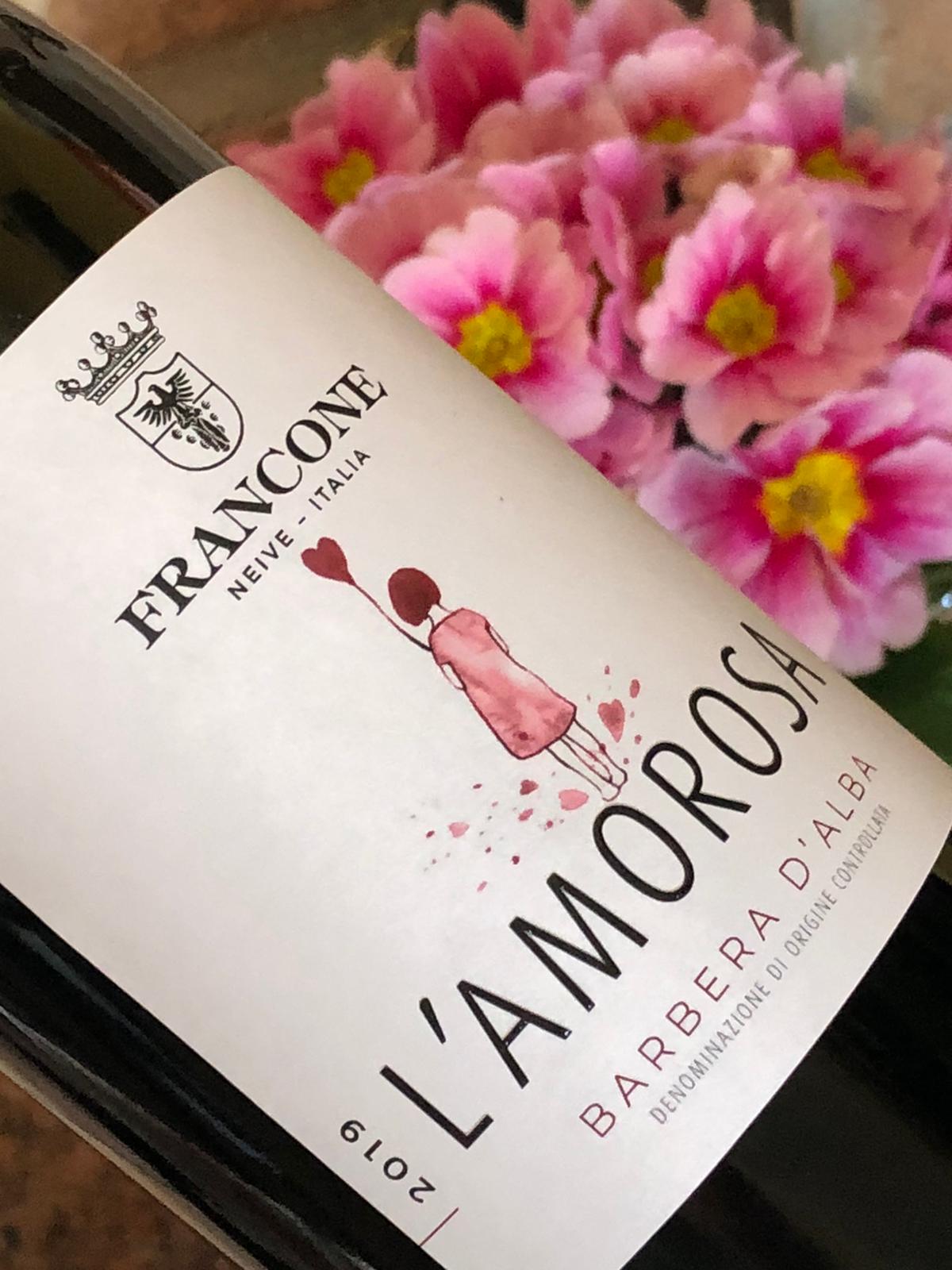
The Barbera d’Alba DOC “L’Amorosa” is one of the most loved wines by our costumers and thanks to the vintage 2016 it reaches the right consideration by the critique awarding 94 points on the guide “I Migliori Vini Italiani” by Luca Maroni. It isn’t easy for a vintage wine, without oak barrel aging, to achieve those results, but we are excited for this: we have always believed in this Barbera wine. Finally, after more then twenty years, it finds the right style young, elegant, fresh, thanks to the graphic design of Alessia Paschetta, who is following us on this way with innovation, awareness and professionalism.
Fabrizio had fun interviewing Alessia for you:
Alessia, tell us of your work, has it always been your passion that you turned into your job?
"I have always been a curious child, I loved handling colours, glue, paper needle and thread for hours. After the scientific diploma, I spent the summer considering several university courses, without taking a concrete decision. Finally I opted, almost randomly, for the Belle Arti Academy, on suggestion of my friend, who told me about a new course in visual communication.
It has been love at first sight. Two months after the degree in visual design it became officially my job and it remained the same since then."
I think that you have an incredible talent for a graphic: when we meet for a new project you listen to what I would like to do, then you follow a different way, yours, and at the end I say: "that's what I really wanted!"
Interpreting the costumers' requests without oppress your creativity must be a challenge!
"Yes, it's true, every time it's a challenge, but I think that this and the creativity are exactly the heart of a Graphic's job. I like establishing a personal relationship with each costumer, I like knowing the person I've got in front of me, speaking together, understanding which his story is. It's exciting to discover what's behind a business, a product or a service: paths made of successes, passions, skills, life choices, coincidences, meetings, but also challenges, difficulties. Well, I try to read between the lines all those things and I try to give back the essence through a visual communication project. Listening is the real key."
When I was looking for a professional for the new Valsellera labels I've been amazed by your packaging for some prestigious Pedmonteese brads. It was 2017, since then we've worked together on 3 labels. Let's talk about the youngest: where did you take the inspiration from for the watercolour of the "L'Amorosa" label?
"At first, the name "L'Amorosa" reminded me of those old postcards with pictures of children with angel's faces. But I didn't want to give in to the vintage fashion; I rather yearned to create a fresher, lighter, almost oniric atmosphere, adapts to express the wine personality and, of course, to reproduce a sense of stylistic continuity with the Leonina's label.
After have been working several proposals, among children, young girls and little hearts, took shape this little girl. It seems that she's having fun, jumping into the puddles, lifting a myriad of heart-shaped droplets with his little feet. I smile if I think that I asked for help to my boyfriend to make a selection of creations to send you, which you showed to your son asking him for his preferred: at the end projects are really a collective work, where everybody gives his little contribution."


